Recent Posts
A founder approves a polished logo that looks impressive on a presentation slide. Then the business launches. The text becomes unreadable on mobile, the symbol resembles three competitors, and the design fails on packaging unless it is printed in full color. The logo looks good, but it does not work.
That gap matters more than ever. A modern logo may appear as a tiny favicon, a social avatar, an app icon, a storefront sign, an invoice, or an embroidered mark. Meanwhile, AI tools can produce polished concepts in seconds, making visual novelty easier to imitate. So, what makes a good logo today?
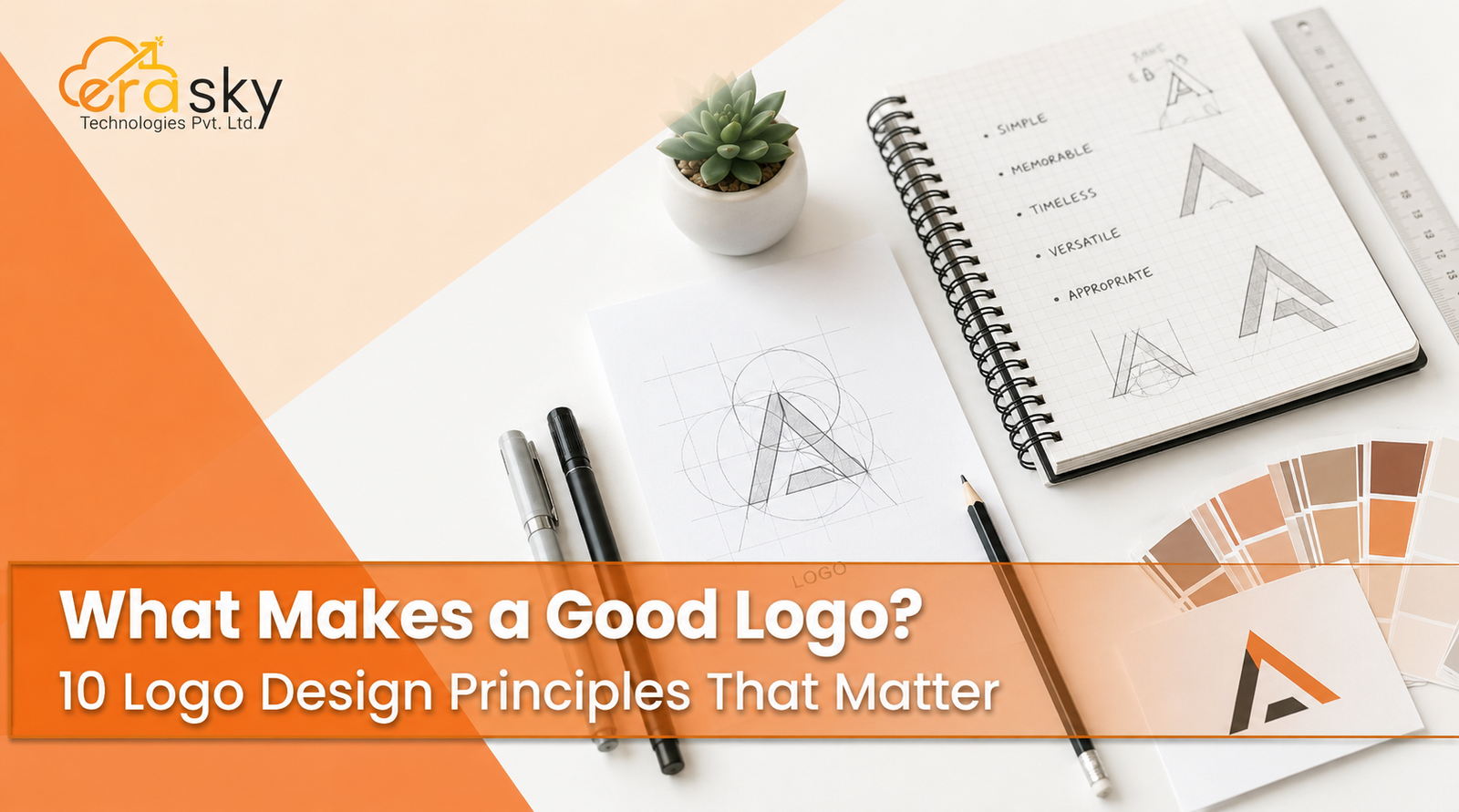
A good logo is a distinctive, memorable, relevant, and reproducible brand identifier. It helps people answer “Which brand is this?” quickly and accurately. Its commercial value comes from three outcomes: recognition, differentiation, and reliable deployment. The following logo design principles show how to achieve them.
The Current Logo Design Landscape
Logo design has moved from one fixed graphic to a responsive identity system with primary, simplified, monochrome, and micro versions. Google recommends favicon images larger than 48 by 48 pixels, while Apple expects icons to remain recognizable across numerous interfaces.
Traditional advice is therefore incomplete. Simplicity alone can produce generic marks, and a logo need not explain everything a company sells. Research involving 195 logos and 13 design characteristics linked recognition to combinations of qualities, including harmony and moderate elaborateness. Minimalism is not automatically superior.
Why Attractive Logos Still Fail
Weak logos often begin with a strategic problem. The business has not clarified its positioning, audience, competitive environment, or future applications, so stakeholders select concepts according to taste instead of performance.
Technical failures emerge when large presentations hide thin strokes, poor kerning, and collapsing negative space. Category clichés also limit distinction. A roof may communicate property, but rarely identifies one property company.
The root issue is treating a logo as decoration instead of infrastructure. Good logo design must connect brand strategy, consumer memory, competitive separation, production requirements, and long-term growth.
10 Principles of Good Logo Design
1. Simplicity Without Generic Minimalism
A logo should contain only the information needed to establish identity. Simplicity improves processing, reproduction, and small-size performance, but simple does not mean interchangeable.
Remove color and effects, then test the mark as a silhouette and favicon. The goal is minimum unnecessary complexity with maximum identity.
2. Distinctiveness
Distinctiveness may be the most commercially important of the principles of logo design. It helps customers separate one business from its alternatives and can support stronger trademark positioning.
It can come from proprietary shapes, custom letterforms, negative space, unusual proportions, or characteristic colors. Compare the proposal with 20 to 30 competitors. It should feel relevant without looking available for any of them.
3. Memorability
A memorable logo provides visual shorthand. An ordinary circle is simple but hard to attribute, while a detailed illustration may be difficult to recall. Strong designs balance cognitive ease with identifying character.
Show it for five seconds, remove it, and ask viewers to describe or sketch it. They should recall the feature that points to the correct brand.
4. Strategic Relevance
A logo should fit the audience, positioning, price point, personality, cultural context, and ambitions of the business. Appropriate does not mean literal. A technology company does not need a circuit board, nor does a dentist always need a tooth.
Descriptive logos can help unfamiliar businesses communicate quickly. Research across six studies found that they can improve perceived authenticity and purchase intention in some contexts. Yet highly descriptive marks may be harder to differentiate and protect. The right balance depends on whether immediate explanation or long-term ownership matters more.
5. Legibility and Visual Clarity
If a logo contains text, people must read it in realistic conditions. Thin strokes, decorative scripts, compressed letters, weak contrast, and tiny taglines routinely fail on mobile screens.
Reduce the logo progressively. Note where letters merge, counters close, or details disappear. That failure point matters more than how impressive the design looks on a billboard mockup.
6. Scalability and Responsiveness
A scalable logo retains its identity from a favicon to building signage. One rigid composition rarely serves every context, so modern identities use a responsive hierarchy: full logo, simplified lockup, wordmark, symbol, and micro-mark.
Each version should feel unmistakably related. Minimum-size and clear-space rules prevent inconsistent improvisation when the brand reaches new channels.
7. Versatility and Reproducibility
Scalability concerns size. Versatility concerns context. A strong logo works on screens, one-color print, light and dark backgrounds, packaging, engraving, embossing, embroidery, photography, and motion.
Effects should enhance a strong structure, not rescue a weak one. A business should receive full-color, black, white, reversed, and single-color versions plus appropriate vector files.
8. Intentional Typography and Construction
Typography is not decoration. In wordmarks and combination marks, it is part of the identifying asset. Kerning, stroke consistency, optical balance, proportion, curves, and the relationship between symbol and text all affect credibility.
As AI makes generic graphics cheap, proprietary details become more valuable. Custom typography need not mean building an entire typeface. Thoughtful changes to terminals, joins, counters, ligatures, or spacing can create meaningful ownership.
9. Color That Supports Recognition
Color influences visibility, differentiation, and emotional tone, but universal formulas such as “blue equals trust” are unreliable. Meaning changes with culture, category, brightness, saturation, combination, and competitor behavior.
Ask which colors dominate the market and which palette the brand could plausibly own. Then convert the logo to monochrome. If its identity disappears, color is masking a structural weakness.
10. Timelessness and Evolvability
Timelessness does not mean a logo can never change. It means the core mark does not depend excessively on short-lived gradients, type fashions, 3D treatments, or AI-generated aesthetics.
Established assets should evolve carefully. Research involving 632 respondents found that highly committed customers can react negatively to substantial changes in familiar logo shapes. Refresh when equity remains valuable, redesign when functionality is broken, and replace when business strategy fundamentally changes.
A Practical Logo Development Framework
Effective logo development begins with a business brief. Define the audience, positioning, desired perceptions, applications, competitors, and expansion plans. Audit competitor symbols, colors, typography, and clichés to find opportunities for separation.
Choose three actionable brand attributes, then select an appropriate architecture: wordmark, lettermark, symbol, combination mark, emblem, abstract mark, or mascot. Growing companies often benefit from pairing the name with a symbol.
Explore concepts in monochrome, compare shortlisted ideas against competitors, refine typography and geometry, then add color. Build responsive variants and test them on favicons, social profiles, invoices, packaging, signage, and one-color print.
Measure recall, attribution, readability, relevance, and competitor confusion. Conduct trademark screening with qualified legal support. Deliver vector masters, digital exports, color specifications, size rules, clear-space guidance, and misuse examples.
Why Logo Design Requires Systems Thinking
A logo cannot compensate for unclear positioning, inconsistent messaging, or a poor digital experience. It works alongside typography, color, imagery, advertising, packaging, and customer experience. Changing it without aligning those components creates new inconsistency.
This is why businesses often need more than three concepts and a PNG. Era Sky Technologies treats logo design as part of an integrated commercial identity, connecting strategy, visual development, digital implementation, and consistent application. The result is a system built to support growth.
Measuring Logo Performance
There is no universal conversion benchmark for a logo. Compare performance with brand objectives and existing results using recall, correct attribution, competitor confusion, small-size readability, recognition speed, perceived attributes, and implementation consistency.
A practical scorecard can weight distinctiveness, memorability, and relevance at 15 percent each; simplicity, legibility, scalability, and versatility at 10 percent each; and construction, timelessness, and commercial readiness at 5 percent each. Score every area from one to five.
Avoid vanity measures such as social likes, internal preference votes, or the number of concepts presented. Test whether the mark performs against the business objective.
Logo Trends Shaping 2026 and Beyond
Responsive identities, custom typography, motion, and flexible systems continue to grow, alongside a pushback against generic minimalism.
AI is accelerating ideation and iteration. Canva’s 2026 research reported that 97 percent of surveyed marketing leaders use AI daily, yet seven in ten surveyed consumers felt AI-generated advertising was missing something. AI produces options, but it does not solve strategy, refinement, trademark risk, or ownership.
Six Lesser-Known Facts About Effective Logos
- The simplest logo is not automatically the most memorable. Moderate detail can strengthen a distinctive structure.
- Symmetry can influence perceived stability and product quality in some conditions.
- Complexity can support luxury positioning when audiences associate intricacy with craftsmanship.
- Descriptive logos may improve authenticity while weakening differentiation or protectability.
- Loyal customers can resist radical changes to familiar brand assets.
- A visually beautiful logo can still be commercially weak if it fails recognition, reproduction, or competitive testing.
The Big Takeaway
The characteristics of a good logo are interconnected. Simplicity supports deployment, distinctiveness supports attribution, relevance supports perception, and memorability supports recognition. Weakness in one area can reduce the value of the rest.
Likewise, the elements of a good logo, including shape, typography, color, negative space, composition, proportion, and spacing, must serve the same strategic goal. A logo is successful when customers recognize it, distinguish it, and encounter it consistently wherever the brand appears.
Conclusion:
A strong logo is a business asset. It should be as simple as practical, as distinctive as possible, as relevant as necessary, and flexible across media and time.
That requires research, strategic clarity, testing, and consistent implementation. Era Sky Technologies is especially well positioned because it treats the logo, identity, and digital presence as one commercial system, closing the gaps between strategy, design, and execution.
Before scaling an inconsistent identity, test the logo small, compare it with competitors, remove its effects, and ask whether it reflects the business being built. If weaknesses extend beyond the mark, Era Sky Technologies can turn that audit into an identity built for recognition, credibility, and growth.
Ready to strengthen how your business looks and communicates online? Contact Era Sky Technologies to discuss your requirements and build a more consistent, credible, and growth-focused presence.
Frequently Asked Questions
What makes a good logo?
A good logo is distinctive, memorable, relevant, legible, scalable, versatile, and durable across real applications.
What are the main logo design principles?
The main principles are simplicity, distinctiveness, memorability, relevance, clarity, scalability, versatility, strong construction, strategic color, and timelessness.
What are the essential elements of a good logo?
Core elements include shape, typography, color, negative space, composition, proportion, hierarchy, and spacing. Each should support recognition.
Must a logo show what the business does?
No. Descriptive logos can communicate a category quickly, while suggestive or abstract marks may create greater distinction and flexibility. The decision should follow the brand strategy.
How can a business test a logo?
Test it in monochrome, at small sizes, beside competitors, and across real applications. Measure recall, readability, correct attribution, perceived attributes, and confusion with similar marks.
When should a company redesign its logo?
Redesign when positioning changes, the logo fails digitally, resembles competitors, creates trademark concerns, or no longer supports the company’s direction. Do not redesign solely to follow a trend.